Brand guidelines
The Coachbox brand.
Logos, colors, typography, and product screenshots, everything you need to represent Coachbox accurately and consistently.
Download brand guidelines (PDF)Logo
The wordmark is our primary logo. Give it space, and let the brand breathe.

Logo variants
Use the variant that fits your context best. Pick black on light surfaces and white on dark ones. Never recolor, distort, or add effects to the logo.



The antelope
The antelope stands for endurance. Through rhythm, precision and a perfect balance between speed and energy use, it reaches its goal. That is exactly what coaching and endurance sport are about.
Why a second mark
The icon is a supporting brand element. It strengthens visual recognition without replacing the primary logo, and gives us room to work where the wordmark is less suitable or harder to read.
Icon usage
The icon amplifies, it never takes the lead. Think in hierarchy: the logo identifies, the icon deepens.
When to use the icon
When space is tight
When the full logo becomes illegible or too dominant.
- Social media profile pictures
- Favicons
- App icons
- Small gadgets and merchandise
- Watermarks
As a recognizable brand element
When the icon can work as a quick visual anchor.
- Animations
- Loading animations
In support of the logo
When the icon adds to the brand experience without competing with the primary logo.
- Blind embossing
- Inside of packaging
- Footers and headers
- Chapter openers
- Clothing details
- Event material
When not to use the icon
As a replacement for the logo in formal communication
The icon must never be the only brand mention where the sender has to be clearly identified.
- Official documents
- Contracts
- Press communication
- Invoices
- Sponsoring where brand visibility is crucial
Quick decision check
Use the icon if you answer yes to at least one of these:
- Is the space too small for the logo?
- Is the brand already clearly present elsewhere?
- Does the icon work here as a point of recognition?
Use the logo if you answer yes to any of these:
- Does the sender have to be unmistakable?
- Is this a first touchpoint?
- Is this formal communication?
Colors
Black is our primary color, paired with white and a cool gray. Blue, yellow, and green are used as accents, with pastel versions for subtle backgrounds. Click any swatch to copy its hex code.
Sport colors
Every sport has its own color in the Coachbox platform. Use the main color for icons, lines and accents, and the light variant as a background. Click a swatch to copy its hex code.
Swimming
Cycling
Running
Walking
Strength
Rowing
Skating
Skiing
Snowboarding
Multisport
Other
Typography
Inter is our typeface across product, web, and marketing. We use five weights, from Light (300) to Bold (700).
Tone of voice
Coachbox speaks to coaches and athletes with active, motivating and person-focused messages.
This is how Coachbox sounds
- committed
- reliable
- active
- human
- warm
- dynamic
- sporty
- accessible
- clear
- personal
- close
- motivating
- innovative
- professional
- inspiring
- refined
- open
- enthusiastic
How we write
A personal you
Coachbox is an accessible training hub. The you form reflects that commitment: you, coach or athlete, are at the center.
Coachbox writes a we story
Next to the name Coachbox we regularly address our audience as we, to create a collective feeling and keep the threshold low.
Dutch and fluent English
To reach both audiences we use Dutch and easy-to-read English for everyday messages and stronger copy.
Active language
Coachbox writes in the present tense wherever possible. No convoluted phrasing or passive constructions, but active language that stays close to the athlete.
Simple punctuation
We keep our punctuation simple and natural. No unnecessary colons, brackets or dashes. We choose short, smooth sentences that feel human.
Not this, this instead
The same message, written twice. The version on the right is the one that sounds like Coachbox.
Find great tools to coach better. Coachbox offers a large number of features you can use to increase your productivity.
There are many roads to better performance. Explore them from one recognizable starting point. Coachbox gives you the tools to translate your vision and put power behind new goals.
Ready to get started? We'll get you up and running in no time. Start with our zero-risk free trial and optimize your coaching today!
Want your athletes to go the distance? Progress starts with a plan. Find the right track with our free trial, and experience how Coachbox empowers your coaching every step of the way!
Get the best out of yourself and your athletes. Our extensive e-learning for endurance athletes is the perfect investment in your future as a coach. The modules cover training theory, nutrition, recovery and more.
To seize the moment, you have to understand the effort. Discover the Coachbox Academy, grow your know-how and get the full potential out of the training, nutrition and recovery of your athletes.
Photography
Our photography shows real movement and real progress. It feels dynamic, professional and close, without exaggeration or spectacle. Sport is shown as something human and achievable. Motivating, not intimidating.
Do
- Show people in motion
- Use natural light and real environments
- Frame dynamically and close
- Embrace imperfection and effort
- Keep colors calm and natural
Don't
- Use posed or staged imagery
- Apply heavy filters or dramatic color grading
- Shoot with artificial or studio lighting
- Over-retouch skin or details
- Create overly heroic or extreme visuals
Product screenshots
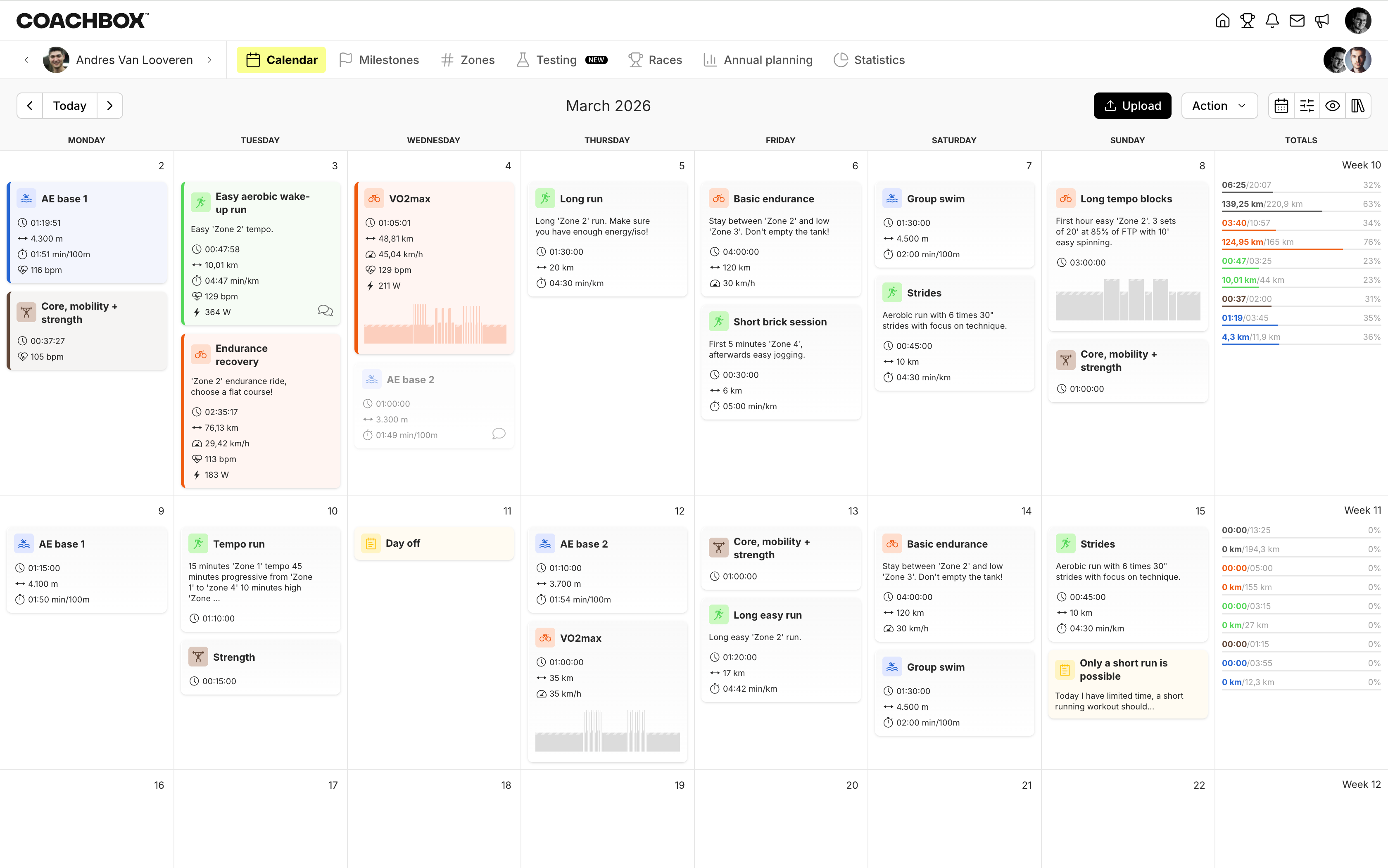
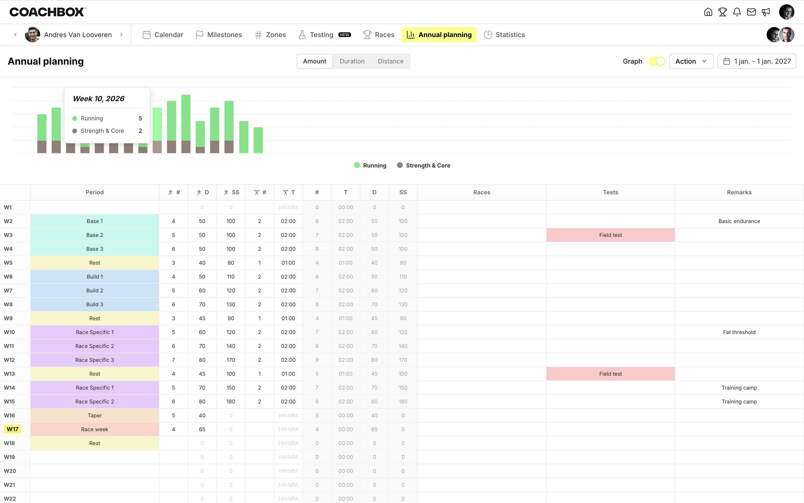
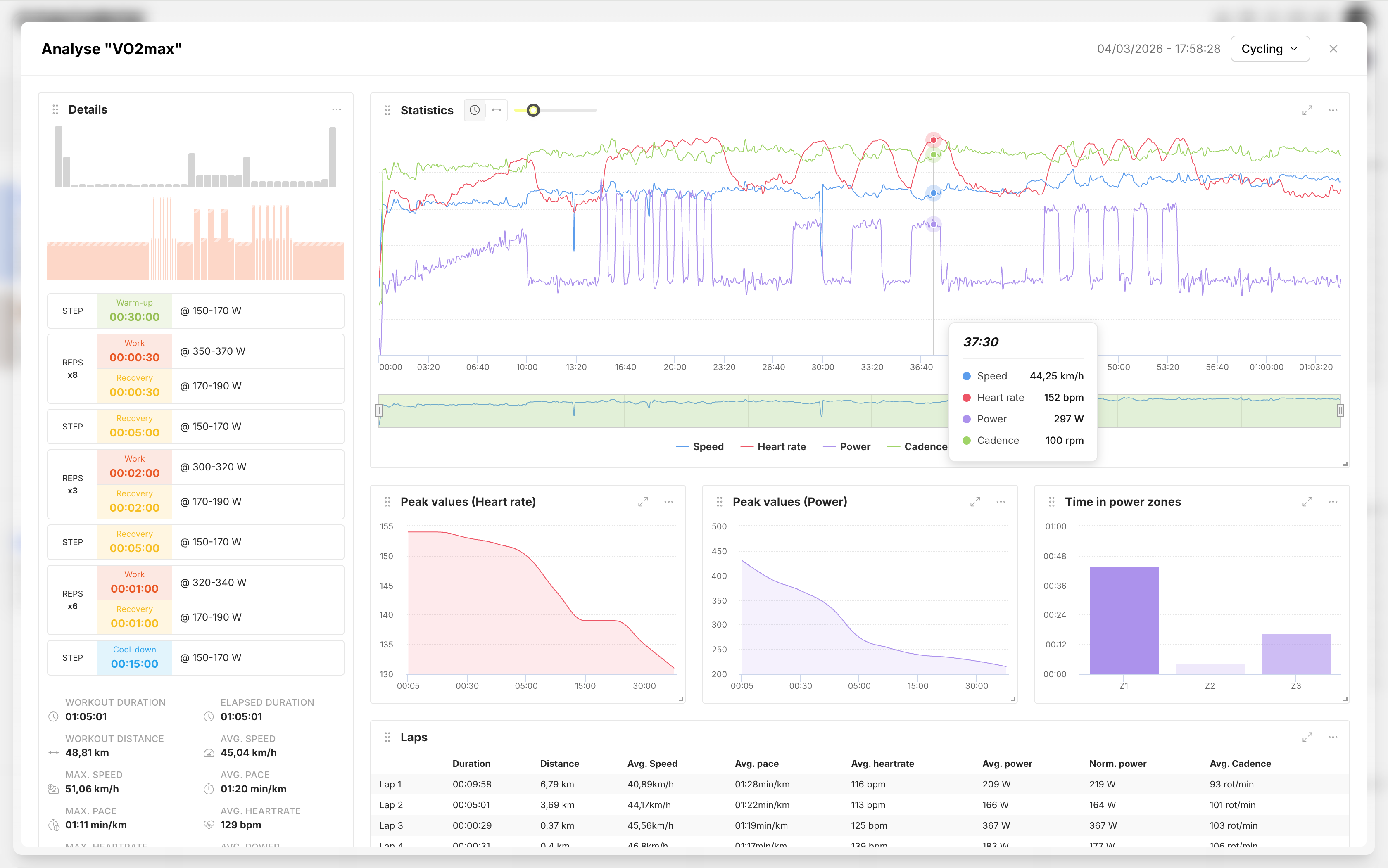
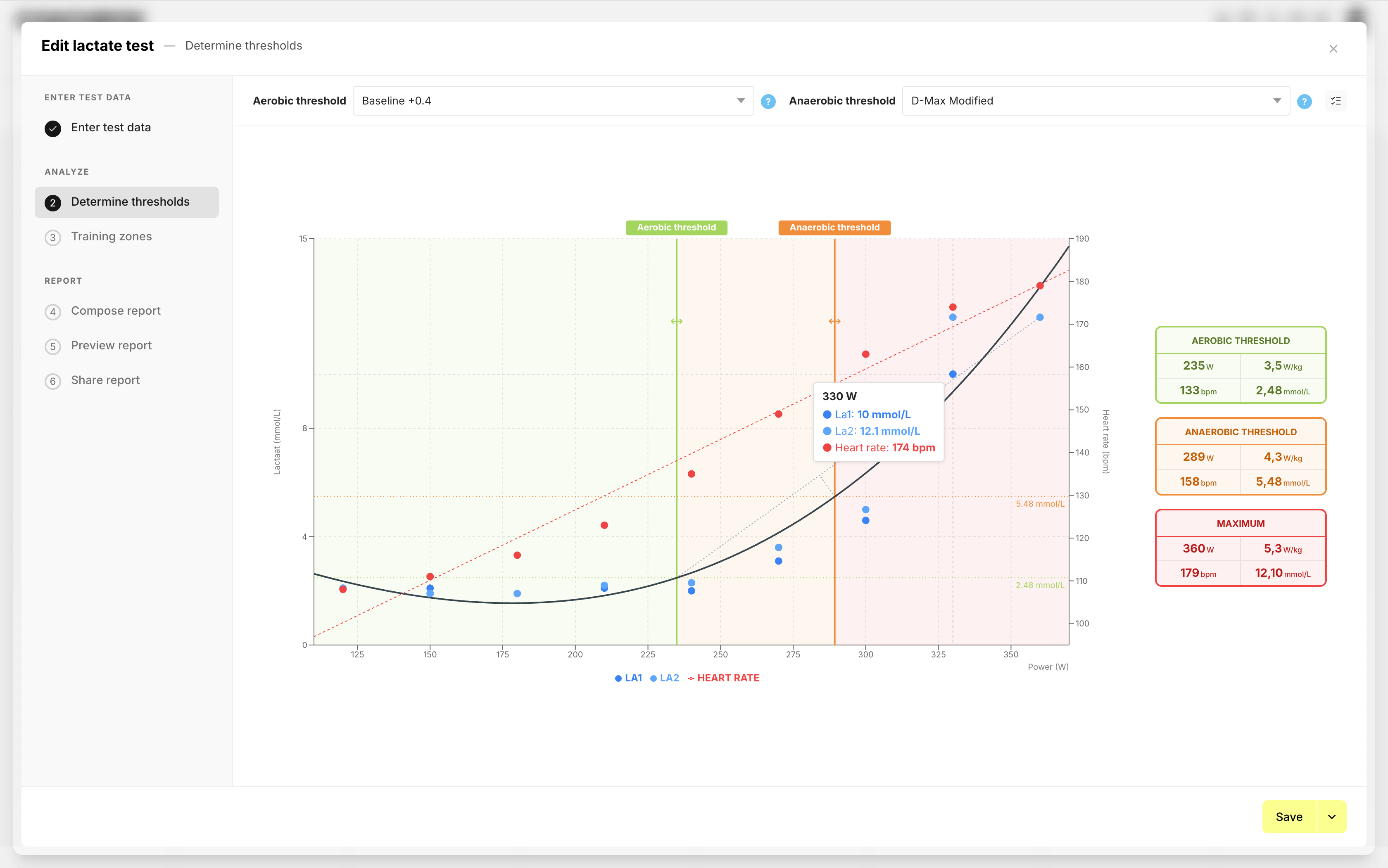
High-resolution screenshots of the Coachbox platform. Use them in articles, presentations, or partner materials, no further approval needed.




Questions about the brand?
Need a custom asset, want to co-brand, or unsure how to use something? Drop us a line and we'll help you out.
We aim to respond within one working day.